A Door from Hell
August 30, 2018

At first, I noticed my own inability to open that door between the second and third floor of the main North Campus building. I’m sure you know which one I’m talking about because you also surely get it wrong. I remember one time when I tried to open it and got it wrong, I complained to the guy behind me and he said: “I’ve been here for a year and I still get it wrong every. single. time.”
Then, I spent a pause watching people going down to the cafeteria through that door and I noticed that almost no one could use it properly! I even caught one student, using it twice in the 15 minutes span and get it wrong both times.
It reminded me a Vox video I watched a long time ago. I’m posting it here:
“If you continually get it wrong and other people continue to get it wrong, it’s a good sign it is a really bad door”
The conclusion is this: It’s not your fault you are unable to open that door, it is simply poorly designed.
I love thinking about this because it makes you realize even simple things are more complicated than they look and need some much iteration to make it perfectly usable.
Design is everywhere we look. All the small details have been created with the purpose of being used by humans. I like thinking that optimization starts with little things such as making doors easy to open.
We could extend the reasoning to User Experience in Technology. All websites/apps/programs should be created keeping this in mind. We are all organic machines that react and think alike. So to all future creators and entrepreneurs: Operability and Feedback will make us want to use your product!
Don’t be the bad door guy/gal!
A harmonious Monday morning starts with a harmonious door.
Please IESE, make this door harmonious again!
**EDIT: I actually realised that I’m ranting about this door, but offer no explanation nor solution to the problem so here it goes:
It is actually what designers call a “Norman” door. These doors have 2 characteristics:
- The design of the door tells you to do the opposite of what you’re actually supposed to do.
- The door gives you the wrong signal and needs a sign to correct it.
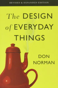
This theory was created by Don Norman, in his book The design of Everyday things.

THE INTERESTING PART IS HERE:
When you are coming from the stairs you should PULL
when you are coming from outside, you should PUSH.
If you can’t remember that, there is a visual trick to get it right:
There is a little metal pad that is blocking the door on the high part of the doorframe that prevents it to open toward the outside of the building.
Look up before opening, and you’ll see what you’re supposed to do.
Best of luck!

Waïna Landauro is an 2020 IESE MBA. Author of iesemba.com and creator of the business videogame The nasty consultant. Founder of Interview practice platform Mockmate.com. He’s currently supporting startups at Google Cloud. Talk to digital waina
Im curious, is there a sign or some visual reference on how to open the door properly? if not, why not?
Hello Pablo,
I’m glad you ask! I actually forgot to say this in the post:
When you are coming from the stairs you should PULL
when you are coming from outside, you should PUSH.
For the visual cue:
There is a little metal pad that is blocking the door on the high part of the frame.
If you want to stop being confused, look up before opening, and you’ll see what you’re supposed to do.
Best!
Seems like for fire safety all doors should push out… but to avoid taking the door off the hinges I get why some architects prioritise keeping the gear/kit inside.
Next terrible design to hate: toilet seats that fit too closely into the lids, so you have to really grab it to push it down. For this and the poorly designed doors: need women + people of different cultures to test everything!
That’s a really good point! Culture and gender play a big role in everyday design!
We can send teslas around the Sun but we haven’t figured out how to solve the toilet seat issue. What are you doing Elon??